Is possible to implement a responsive design in the actual CSS!?
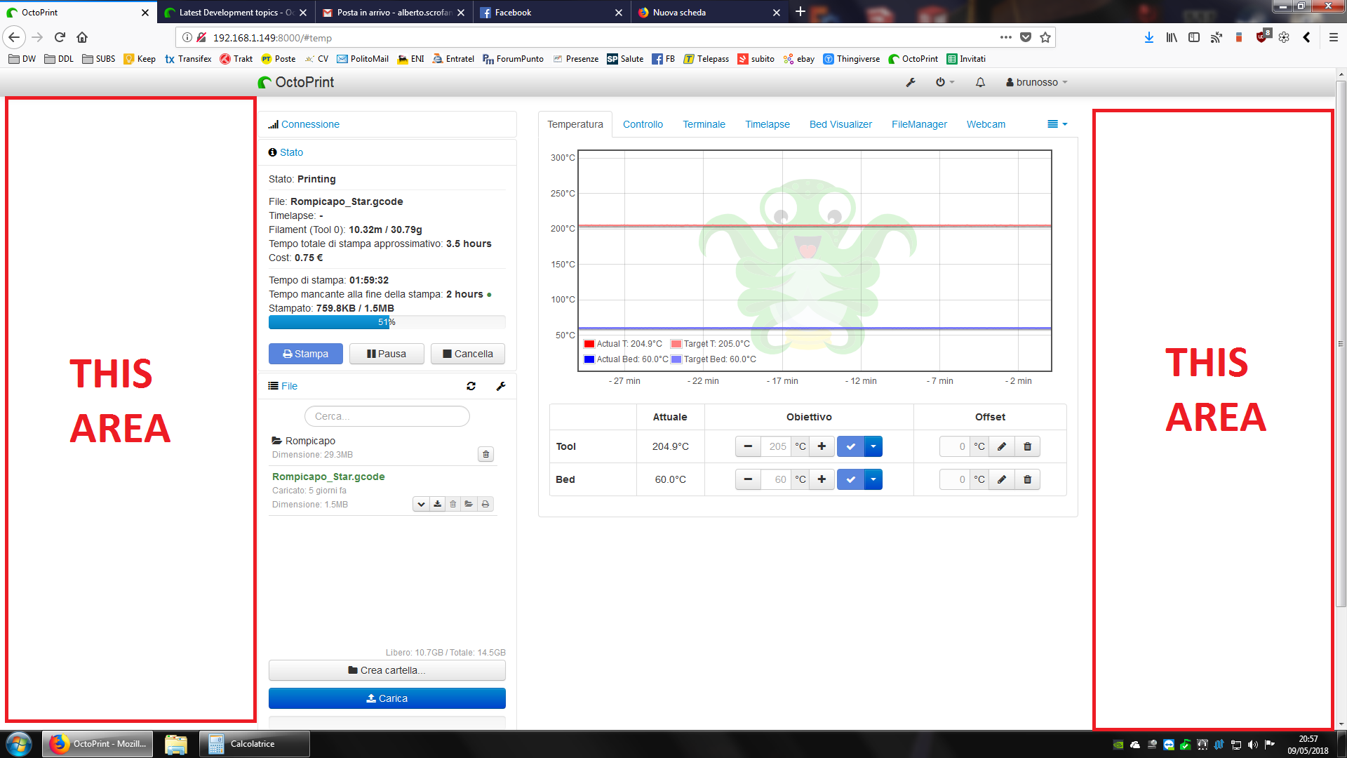
I have a 24'' screen with a resolution of 1920x1080 and i want to use those white areas.
For example i want to move the Connection and State tab to the left. Move up to a single column the Files tab and maybe enlarge all the remaining tab to occupy all the right white area.
Typically, you add the "breaking CSS" at the bottom of a style sheet and tweak the things that were seen earlier. You attempt to make the minimum changes required to move things around.
I don't claim to know it all in this area but the bottom of this stylesheet has some @media queries which I created to target specific computers/resolutions/orientations.