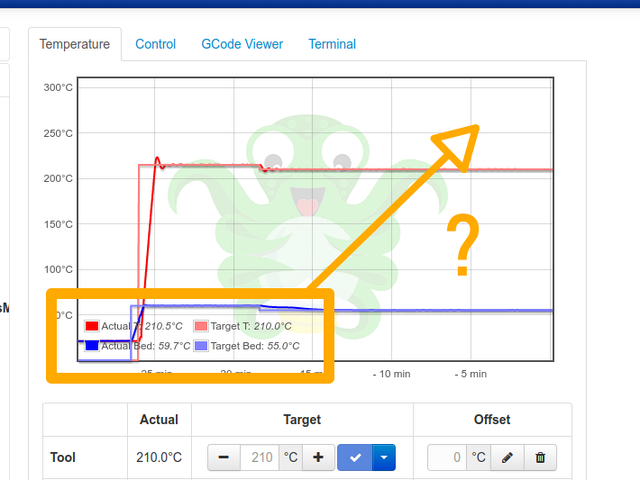
The graph always gets in the way of the text or vice versa. The shadow and the line being in front of the text also doesn't makes it better. So I thought about moving it somewhere else, like the upper right corner? What would be the easiest way to do this?
