Sorry. That was my fault. I totally missed when you said you were using that plugin. I’m not sure about what needs to change.
Hello,
I'm trying to do some stuff with the help of Themeify.
I've reached a point that I don't know if it's even possible to do what I want.
Both screenshots have a contour on the things that I'd like to move.
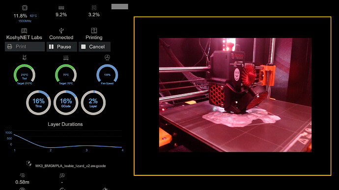
This is what I have now:
And I'd like to reorganize it a bit more to look like this:
The Head and Bed button groups are added using Custom Control Editor plugin.
The Webcams button group is from Multicam plugin.
This is what I currently have in my Themeify setup that is regarding this:
#control-jog-custom   clear           none
#control-jog-custom   display         inline-flex
.custom_section       padding-right   15px
This is allready over my very basic knowledge of css.
Maybe someone that has a bit more experience will be able to help me.
You might go into the ~/.octoprint/config.yaml in the control section and see if Webcams is represented. It might be as easy as replacing the word "vertical" with "horizontal" in that case.
You might also see if you can simply reorder the list items in that same section (assuming that they're there).
Good tip - I haven't done any mods to my OP install for so long I forgot that file exists 
Unfortunatelly the multicam entry only contains this:
  multicam:
    _config_version: 1
    multicam_profiles:
    - URL: http://192.168.1.30/cam1/?action=stream
      isButtonEnabled: false
      name: Przód
    - URL: http://192.168.1.30/cam2/?action=stream
      isButtonEnabled: true
      name: Tył
    - URL: http://192.168.1.30/cam3/?action=stream
      isButtonEnabled: true
      name: X-End
    - URL: stream
      isButtonEnabled: true
      name: Extruder
    - URL: http://192.168.1.30/cam4/?action=stream
      isButtonEnabled: true
      name: Filament
Also about my need to reorder things. Turns out that making the multicam button group horizontal is the only thing that I'll be changing. After some tests I'm moving the Head and Bed button groups back down.
Hello,
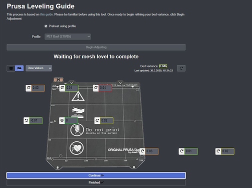
can everybody help me to correct the Prusa Leveling Guide after interface scale?
greetings
Heiko
Hello everyone
I used some good tweaks from this page. Thank you.
I'm trying to remove bottom footer. And note under files section " Hint: You can also drag and drop files on this page to upload them."
I tried several thing but no success. Is there any suggestion ?
The width of the graph is hard-coded in the plugin itself, you'll not accomplish that with themify.
I edited the python myself but that means on next update it is lost
how do you get the button "print" so wide? found it
Check out my octoprint blog post. I believe I documented it there in detail.
Hello, to edit the CSS directly can also be written in this file:
venv\Lib\site-packages\octoprint\static\css\octoprint.css
Unfortunately I do not know if this file will be overwritten during an update. But you could write a small script that adds the custom CSS again.
As an example, I arranged the sidebar as a grid on large screens so as not to roll too much
@media only screen and (min-width: 1300px) {
    .octoprint-container {
        margin-top: 20px;
        width: 100%;
    }
    #sidebar {
        width: 50% !important;
        display: flex !important;
        flex-direction: row-reverse;
        flex-wrap: wrap !important;
    }
    .accordion-group {
        width: 48% !important;
        margin-left: auto;
        margin-right: auto;
    }
}
Yes, it will be overwritten by an update. I'm somewhat sure that there is a octoprint.less file in that same subdirectory which is compiled into octoprint.css but I'm not sure what events could trigger that (overwriting your edit).
You can write a simple plugin which has a stylesheet and overwrites the style as you've trying to do. This attempt shouldn't be overwritten by updates of OP.
THANK YOU!! I just posted in the Help forum asking how to do this about an hour ago, but kept searching and found this. Made the two changes you mentioned and the container did indeed resized, but the actual list of files inside and the scroll bar for them, did not. So it was the same size, just in a longer panel...meaning a bunch of blank space below it.
So I too opened the source for the page and found a section for the scroll-wrapper in this division and added a third line:
.scroll-wrapper height 750px
This fixed it!!! Never would have figured this out w/o finding this thread however!!
Hello,
I have looked over this blog, everybody does something, but I don't really get a clue of the overall correlations between selectors CSS-Rule/Value and a direct map to the gui.
Could anybody make a Picture where the selector and gui is directly set visibly into correlation!
If already exist and I have overseen it sorry for the question but please give me the link,
Otherwise would really appreaciate the visual selector map of the gui
Thank you very much in advance
Apologies that I can't do screenshots at the moment. I'm out here building a house and most of my stuff is in storage.
The general approach that I take is to open up the OctoPrint interface (in Safari in my case), right-mouse click the part of the page which I'd like to change.
Let's say that I want to make the right-hand column of the Terminal tab wider/taller so that it will take up more screen real estate. So I right-click that section and choose Inspect from the context menu. This opens up the Developer's Console which takes up the bottom half of my screen.
Since I know HTML I then navigate around in this area. The usual type of element I'm targeting is a DIV tag which might contain that big rectangle which represents the right-hand column. Assuming that I've found the DIV tag in question, I then look for one of two things: an ID attribute or a CLASS attribute.
The ID attribute in theory would be the most selective way that I could create a CSS selector. I could reasonably assume that I won't be accidentally affecting other things. The CLASS attribute is your second-best option since it might result in this unwanted side-effect I've just mentioned.
Now look at the examples posted here. The ones which begin with a pound sign in the selector are targeting a particular ID as seen. The ones which begin with a period in the selector are targeting some CLASS attribute.
Essentially, it's like: 1) create a filter which matches one or more elements (this is the Selector part), 2) change one attribute for all those which were found (this is the CSS-Rule part).
If you look at my first post on this thread, I've actually shown the ones which I've done. There's one to expand the .container class to be much wider and then there's another a little later to change the height of the #term (Terminal tab).
Hey guys - using Themeify I've been able to resize the Files window so that I can see more items in the list at any one time. The following items achieve the kind of thing that I'm after and you should be able to see the area expand as soon as you hit the tick button:
.gcode_files height 600px
.slimScrollDiv height 600px
However, when I reload the page, the change doesn't remain. I have to go back into the settings and then untick and retick. Any ideas about how to resolve this? I think there may be another property somewhere which is overriding either of the properties above upon loading the page.
Is there a parameter to make the cam feed screen a little larger in size? I have a 7" display monitor in my office to view the prints in action, and the cam feed screen is pretty small.
It there a method to export/ import Themify settings? I want the same config across all of my Octoprint instances.
Thanks!!
It would be saved when you use the full Backup & Restore feature of OctoPrint, otherwise I think the configuration is just stored in the config.yaml file if you wanted to access it to just copy & paste.
Awesome, thanks so much!


