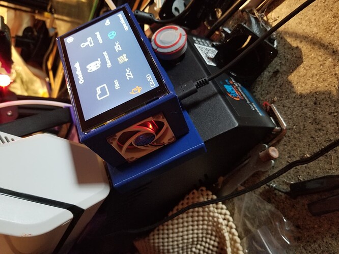
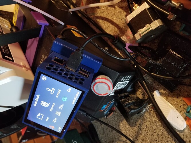
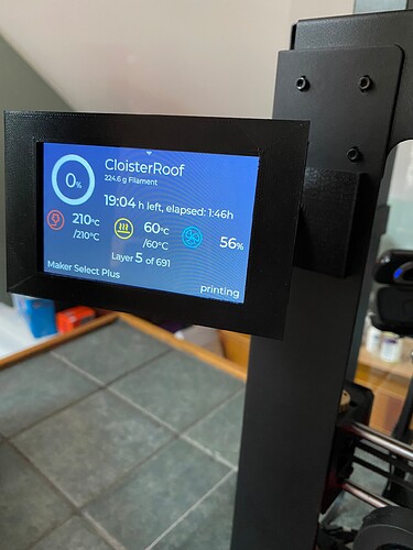
I have OctoDash set up on a Hyperpixel 4, in a self-designed enclosure. I'm finding that some of the elements -- like the scroll bars, and that tiny little disclosure triangle that's often at the top of the Display -- are a bit too close to the edge of the frame to be easy-to-use touch targets. It's probably counter-intuitive to try to reduce the screen image at that size, but I was thinking that if I were to do this just enough to bring them away from the edge of the frame, they might work a bit better. The question is -- how?
I did some quick research into settings that might reduce the Display Image size, though I'm concerned that it wouldn't also reduce the touch overlay. There doesn't seem to be anything specific to the Hyperpixel 4 to do this, either. (It's a great Display, but from what I've read, I feel as though I'm lucky to have it working at all.)
Then I was thinking about using CSS to reduce what I guess would be referred to as the "Viewport" in web design terms (?), but I didn't see anything in the OctoDash settings that seemed as though it would correspond.
Having OctoDash set up is an extra, and this isn't a difficult problem to work around, but my ability to hit touch targets is not improving with age! So I'd be curious as to any recommendations as to how I might go about this.


