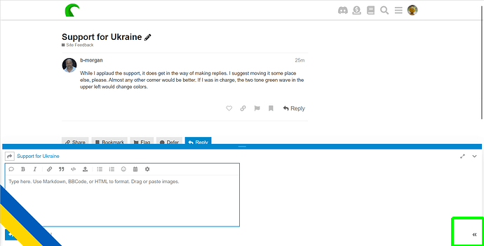
While I applaud the support, it does get in the way of making replies. I suggest moving it some place else, please. Almost any other corner would be better. If I was in charge, the two tone green wave in the upper left would change colors.
3 Likes

tentacle, but yeah think it needs adjusting. doesn't effect me as much on widescreen monitor but noticed at work it covered the buttons.
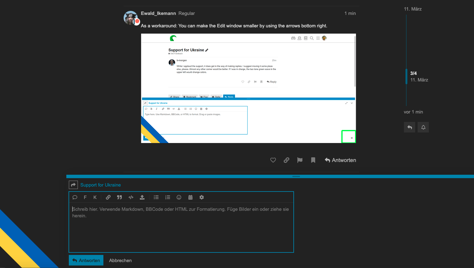
As a workaround: You can make the Edit window smaller by using the arrows bottom right.
Depends on the size of your screen/monitor.
1 Like
I'll look into it
Modding the style to use z-index = 10 seems to work.
1 Like
Temporarily disabled again, will see whether I'll use the z-index or some other solution tomorrow (it's 11pm here and I'm exhausted), but some kind of support expression will be back here as well.
2 Likes
Replaced with a top banner. Haven't yet found a way to make it stay like the nav bar, but it's there at least. Thanks for the heads-up regarding the UX issues with the reply form, appreciated!
4 Likes