ok, no point adding extra code if it isn't needed...
Probably a daft question, but...
Would this instance of
@media (max-height: 768px) {
}
Cover both a 480 and 720 high resolution without any issues or am I miss understanding it completely?
I ask as the Official 7" Pi display has a 800x480 resolution... Which isn't available and most topics I've read say use the framebuffer option in the config.txt file...
but I have been messing around with 1280x720 and various other settings/tweaks, well trying to at least... combined with x-large font in the customization part of the TouchUI plugin.
Here's the approach that I take with my students (at a "flipped-learning" software development academy)...
Read this to get a well-described take on @media queries. Your answer is in the first terminology paragraph.
What I usually do in developing anything is unique, I'd guess. It's a baby-step approach and it goes something like:
- Okay, I'm trying to create an @media query that changes the height of something visual
- Create a new @media query and put it at the end of the CSS file (or LESS file)
- Try to make the query as simple as possible: one filter like
max-height in this case
- The content of the style should be dramatic, like changing the background color to YELLOW
- Verify your assertion that the @media query is being applied with the iPad in landscape mode, portrait and/or your workstation in the emulator version(s)
- If successful, then proceed to add complexity or more specificity in the filter as required
So many times, my students bring me code in some JavaScript function and the function isn't even being called. The first step should always be: prove that the change that you just made is being seen in the output.
1 Like
Will have a read, Thanks!
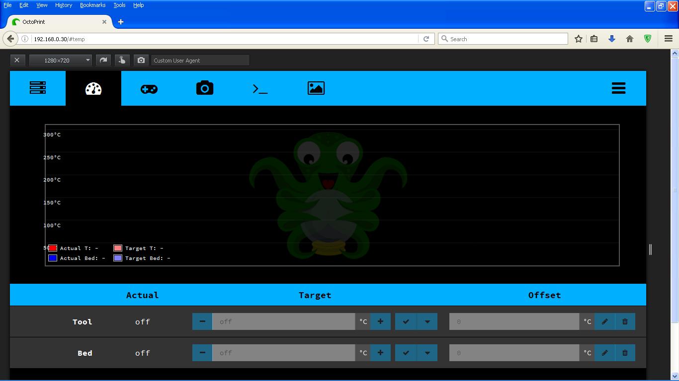
Right... after getting the temperature-graph displaying correctly.... it's done exactly what it did last time, it's like touchui is ignoring the custom file... everything else is fine other tabs, x-large font etc etc... But the temperature-graph is all squished again and nothing I do is changing it?
Seriously considering forgetting about using touchui altogether!?!
Try reloading the page. Try restarting OctoPrint.
There are times when Themeify's modifications don't take place (for whatever reason). It's possibly a timing thing; there could be times when the extra modifications don't happen before the browser has already given up on the add-ons.
Keep your head and try again.
1 Like
I wouldn't mind so much, but no one else seems to of had this problem.... must be something I've done or not done... doesn't make any sense otherwise!?!
It's just that the author apparently doesn't own an iPad. That happens.
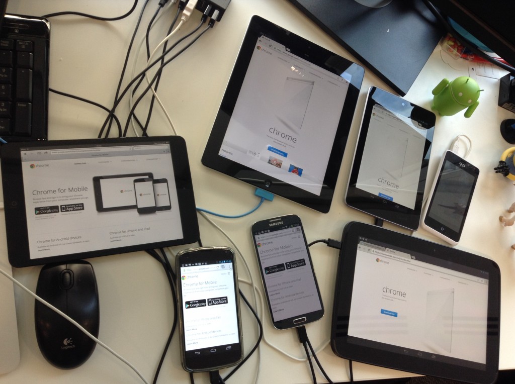
You're in luck with me because I've given a talk on BrowserSync and for the video, I had two iPads (different orientations), two iPhones (different versions), an Android phone, a Microsoft phone and a workstation all going to the same website. I then demonstrated how to edit @media queries while all those devices showed the results in realtime. (Pretty cool demo.)
After a while you realize that it's impossible for most people to code their websites so that everyone can get a reasonable experience. There's just way too many phone types and resolutions. You just do the best that you can and follow your github issues.
1 Like
ok, after a lot of messing around... got it displaying correctly again...
my custom LESS file now has the following changes....
@main-font-size: 20;   // changed from 16 to get x-large font

#temp {
margin-left: -@main-gutter;
margin-right: -@main-gutter;
overflow: hidden;
> div:first-child {
.box-sizing(border-box);
overflow: hidden;
width: 100%;
height: 60vh;
max-height: 390px;   //changed from 300px
min-height: 390px;   // changed from 140px (not sure this was actually needed tbh)
padding: 0 @main-gutter;
margin: 0 0 @main-gutter;
#temperature-graph {
.box-sizing(border-box);
position: relative;
background-position: center 37%;
background-repeat: no-repeat;
background-size: auto 80%;
height: 108%;
max-height: 390px;     //changed from 320px
width: auto;   //changed from 100% (to get the temp legends outside the graph)
margin: 0;
@media (max-height: 400px) {
height: 110%;
}
@media (max-height: 300px) {
height: 112%;
}
What I don't understand is why isn;t the @media (max-height): 400px query doing what I've done?
Or am I still not understanding it correctly?
In a case like this, I'd do something dramatic in that section (like changing the background color to yellow) and... adjust the @media filter... until it works.
1 Like
I'm going to carry on with it... must be a simpler way to invoke the needed change other than copying the complete touchui.bundled.less file and modifying just this small section...
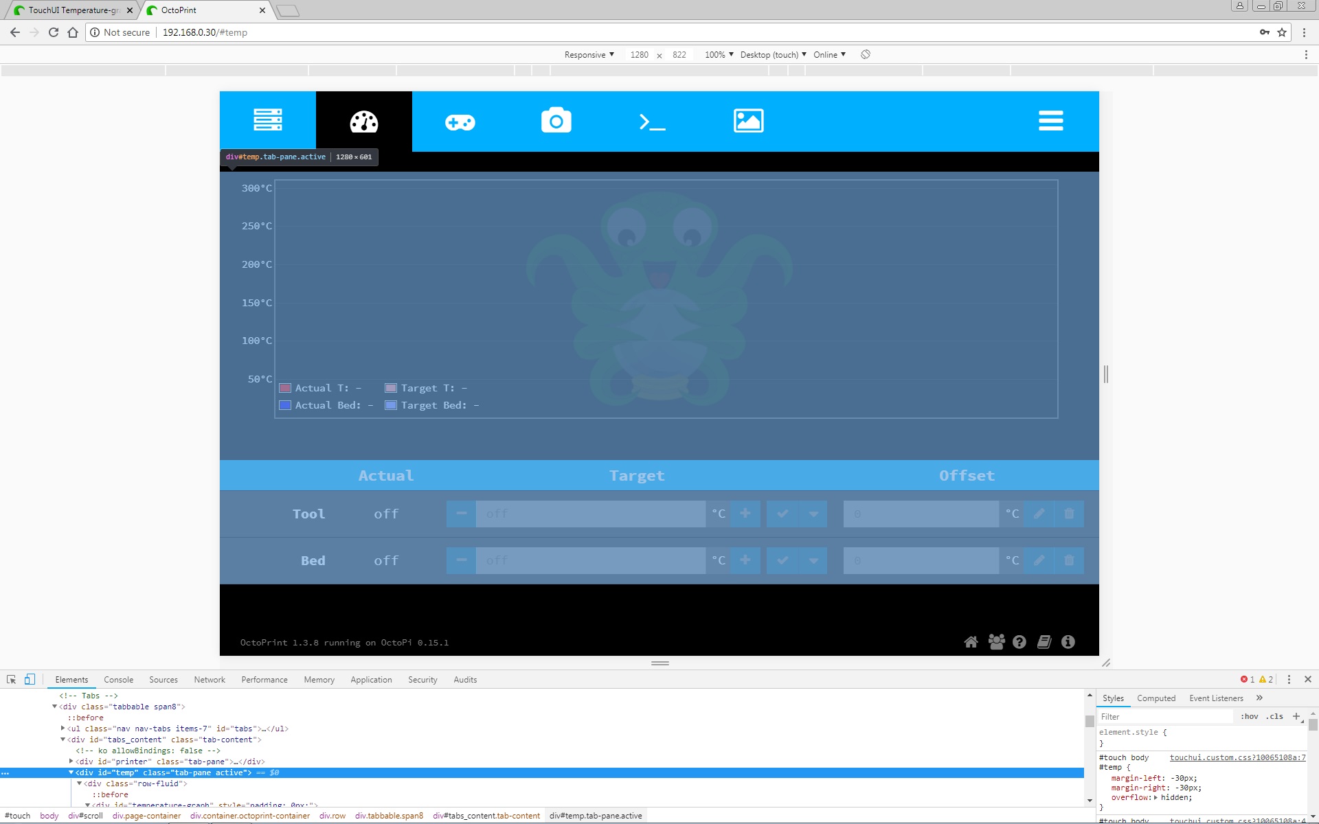
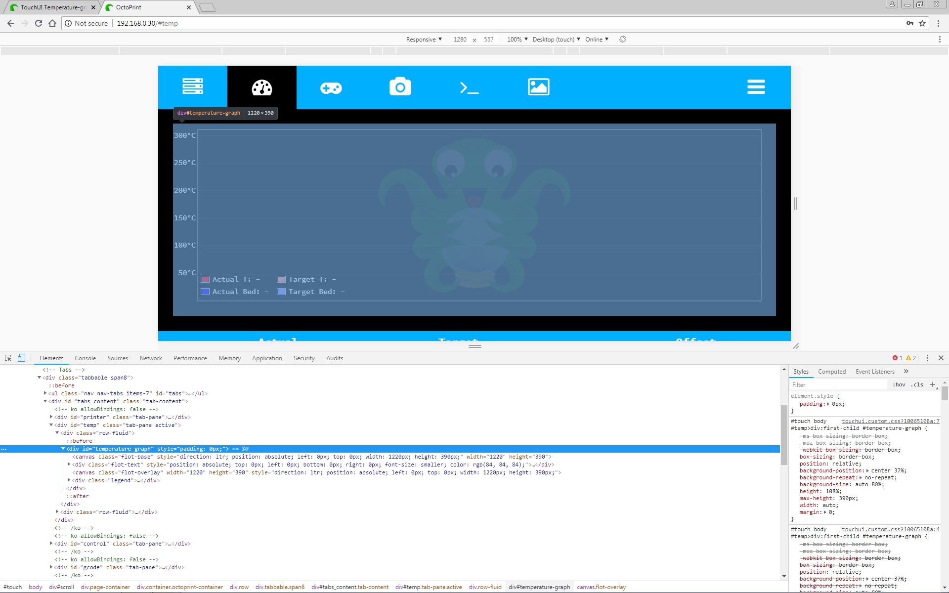
Am I right in thinking the...
#temp relates to the area/box that the graph appears in?
And...
#temperature-graph relates to the size of the graph itself?
That's an interesting thought. What I'd do in a case like this is that right-mouse click -> Inspect thing. Click the HTML at the bottom and it should highlight what it is in the top.
I personally set a background image for #temperature-graph but you could be right in thinking that it's #temp instead. I'm thinking that #temp may be the wider width of the two and that the normal background image for #temperature-graph determines that div's width.
1 Like
Ok...
#Temp = active tab pane/area... excluding margins, navbar and footer -
#Temperature-graph = area available for the graph to use excluding margins -
Original #temp has max-height of 300px with a height of 60vh
Which should be plenty to display on the official display... so still none the wiser as to why it was squished to start with?
EDIT ~ Unless the problem was it was using the min-height of 140px, and ignoring the max-height for some reason... that would explain the squished appearance, right?
Yeah, you're probably on to it. Sometimes there's a bit of a push and pull among the HTML's styling. The expected behavior (from the standpoint of "responsive website design") is to attempt to contain most things in a div tag which wants, say 30% of the width that you'll give it. And the one to its left wants 70%, for example. The user then can grab the window and re-size it all they want and things just work out.
When individual graphics are hard-coded in width/height then things start to break a little. Granted, the canvas-drawing code was probably a pain to do and so it was fairly hard-coded perhaps.
1 Like
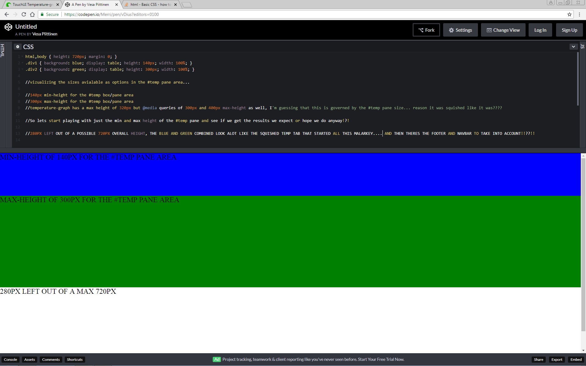
Hopefully starting to understand why it was happening now....
Did a nasty bit of css code to visualize the sizes...
Now lets see if I can edit something to work without everything messing up again!!?!!
Now you're getting it. You have a strikingly-obvious region and you can play with it like this and then finally just do the style you want.
1 Like
Not had a chance to mess around with this again yet... hopefully get the time tomorrow!
Will carry on updating here... others may find it helpful?
For sure.. me! I’m just about to embark on adding octoprint to my Prusa Mk3 and have a rPi and 7” touchscreen going spare for it  sounds complicated.
1 Like
You may not have any problems... no one else seems to have encountered this particular issue as far as I could find?
But I am running the screen at 1280x720 with x-large fonts running within TouchUi's customization option...
The changes to the code I posted in reply #36 work... just trying to find a better/easier/simpler solution if I can.
Will update here once I've tried a few different things...
ok... heres what I got... not sure its the right way... but it seems to be solving the issue.
I'm using @media queries one each for #temp and #temperature-graph...
@media (min-width: 700px) {
				height: 390px;
			}
			@media (min-height: 700px) {
				height: 390px;
			}
Been reading up on this and it seems to be used alot to query screen resolution widths to determine how things are displayed regarding sizing etc?
320px
414px
703px
768px
Wondering if this method would be a better/cleaner solution than whats there... particularly the min and max heights under #temp ... just a thought I had while reading up on it.
#temp {
margin-left: -@main-gutter;
margin-right: -@main-gutter;
overflow: hidden;
> div:first-child {
.box-sizing(border-box);
overflow: hidden;
width: 100%;
height: 60vh;
max-height: 300px;
min-height: 140px;
@media (min-width: 1000px) {
min-height: 390px;
}
padding: 0 @main-gutter;
margin: 0 0 @main-gutter;
#temperature-graph {
.box-sizing(border-box);
position: relative;
background-position: center 37%;
background-repeat: no-repeat;
background-size: auto 80%;
height: 108%;
max-height: 320px;
width: auto;
margin: 0;
@media (max-height: 400px) {
height: 110%;
}
@media (max-height: 300px) {
height: 112%;
}
@media (min-height: 700px) {
max-height: 390px;
}
Not sure if the placement/values are wrong but its working... will carry on tinkering with it.
Unless you have a BrowserSync rig setup to test all the devices at once this can be laborious: 1) make a change, compile the .LESS file into a .CSS, bundle all the .CSS, 2) test on first device, 3) test on second device...
I'd say, "if it works—unless you're trying to publish this—run with that".
1 Like
Wow... now thats a setup!?!
I've only got my desktop, laptop and mobile...
Speaking of my mobile, found a problem in that when displaying on the mobile I can't access any of the tabs in the navbar, wondering if thats due to having the x-large font active?
Will carry on tinkering with it...
I'll add what I've done to the issue I submitted on Paul's GitHub, hopefully he'll be back online at some point and can give me his input on the matter.