Ok...
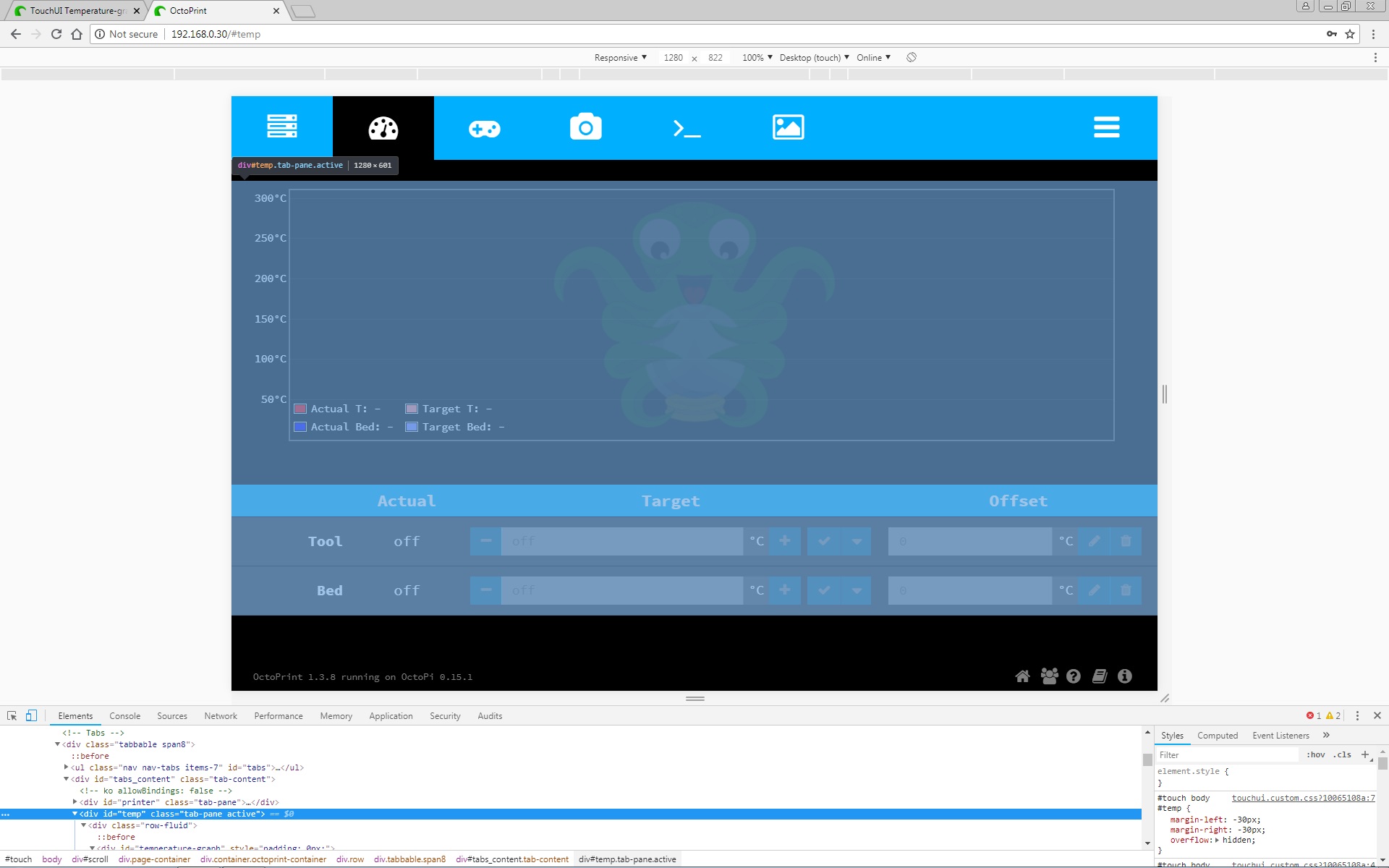
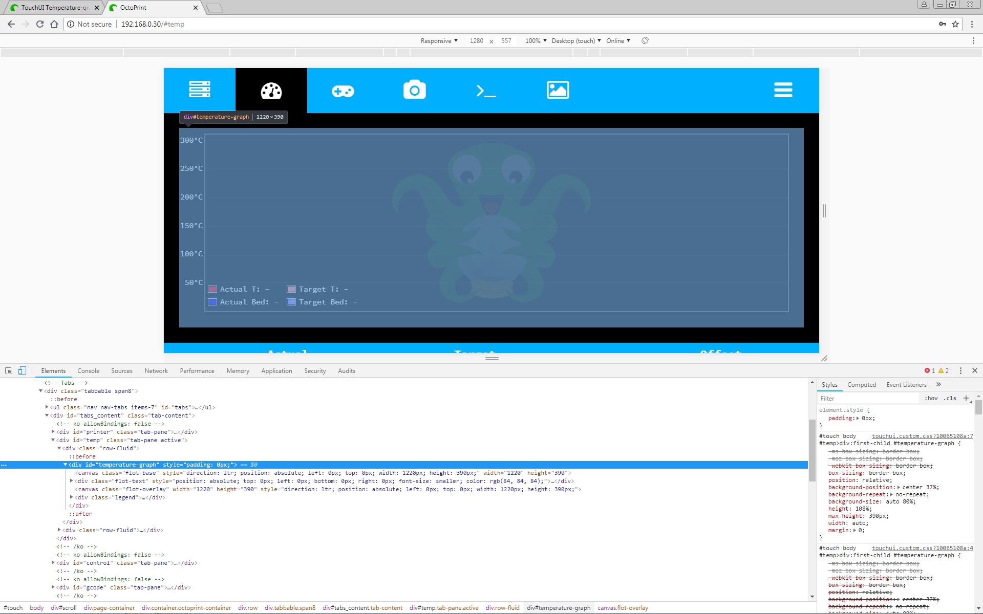
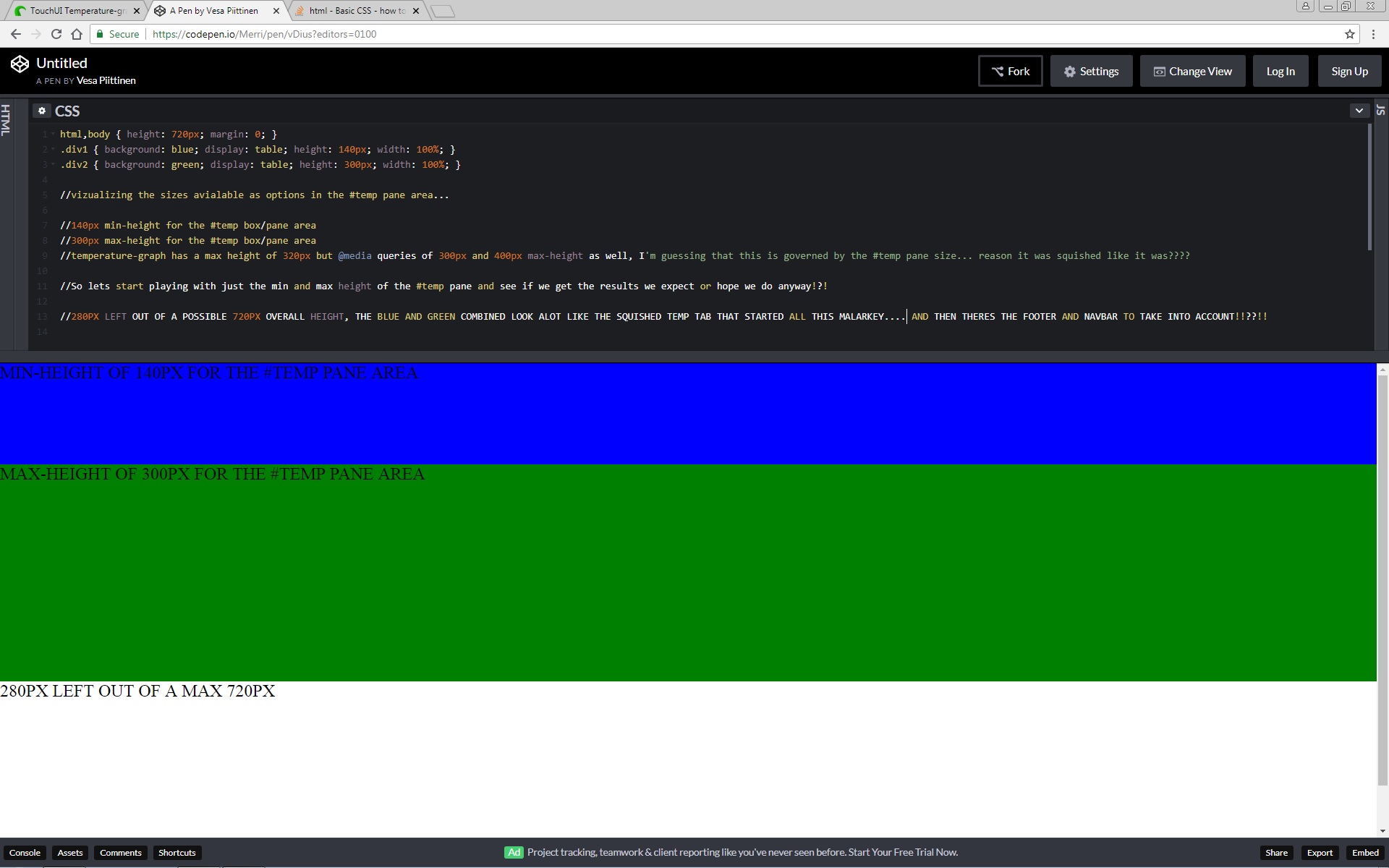
#Temp = active tab pane/area... excluding margins, navbar and footer -
#Temperature-graph = area available for the graph to use excluding margins -
Original #temp has max-height of 300px with a height of 60vh
Which should be plenty to display on the official display... so still none the wiser as to why it was squished to start with?
EDIT ~ Unless the problem was it was using the min-height of 140px, and ignoring the max-height for some reason... that would explain the squished appearance, right?
Yeah, you're probably on to it. Sometimes there's a bit of a push and pull among the HTML's styling. The expected behavior (from the standpoint of "responsive website design") is to attempt to contain most things in a div tag which wants, say 30% of the width that you'll give it. And the one to its left wants 70%, for example. The user then can grab the window and re-size it all they want and things just work out.
When individual graphics are hard-coded in width/height then things start to break a little. Granted, the canvas-drawing code was probably a pain to do and so it was fairly hard-coded perhaps.
1 Like
Hopefully starting to understand why it was happening now....
Did a nasty bit of css code to visualize the sizes...
Now lets see if I can edit something to work without everything messing up again!!?!!
Now you're getting it. You have a strikingly-obvious region and you can play with it like this and then finally just do the style you want.
1 Like
Not had a chance to mess around with this again yet... hopefully get the time tomorrow!
Will carry on updating here... others may find it helpful?
For sure.. me! I’m just about to embark on adding octoprint to my Prusa Mk3 and have a rPi and 7” touchscreen going spare for it  sounds complicated.
1 Like
You may not have any problems... no one else seems to have encountered this particular issue as far as I could find?
But I am running the screen at 1280x720 with x-large fonts running within TouchUi's customization option...
The changes to the code I posted in reply #36 work... just trying to find a better/easier/simpler solution if I can.
Will update here once I've tried a few different things...
ok... heres what I got... not sure its the right way... but it seems to be solving the issue.
I'm using @media queries one each for #temp and #temperature-graph...
@media (min-width: 700px) {
				height: 390px;
			}
			@media (min-height: 700px) {
				height: 390px;
			}
Been reading up on this and it seems to be used alot to query screen resolution widths to determine how things are displayed regarding sizing etc?
320px
414px
703px
768px
Wondering if this method would be a better/cleaner solution than whats there... particularly the min and max heights under #temp ... just a thought I had while reading up on it.
#temp {
margin-left: -@main-gutter;
margin-right: -@main-gutter;
overflow: hidden;
> div:first-child {
.box-sizing(border-box);
overflow: hidden;
width: 100%;
height: 60vh;
max-height: 300px;
min-height: 140px;
@media (min-width: 1000px) {
min-height: 390px;
}
padding: 0 @main-gutter;
margin: 0 0 @main-gutter;
#temperature-graph {
.box-sizing(border-box);
position: relative;
background-position: center 37%;
background-repeat: no-repeat;
background-size: auto 80%;
height: 108%;
max-height: 320px;
width: auto;
margin: 0;
@media (max-height: 400px) {
height: 110%;
}
@media (max-height: 300px) {
height: 112%;
}
@media (min-height: 700px) {
max-height: 390px;
}
Not sure if the placement/values are wrong but its working... will carry on tinkering with it.
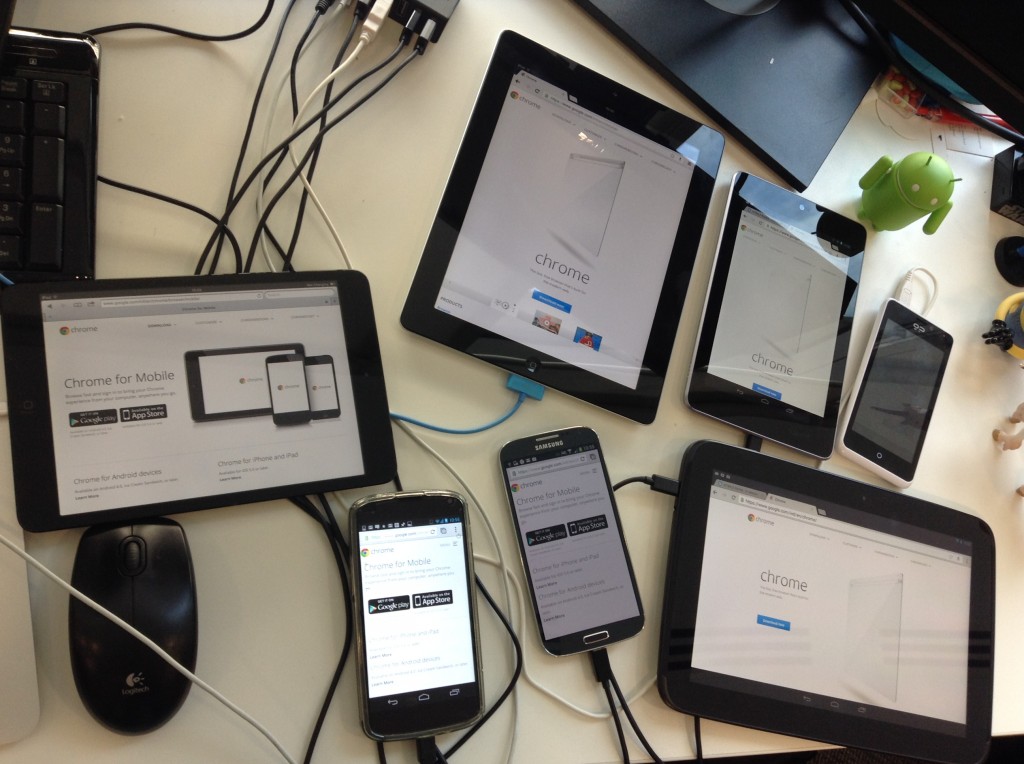
Unless you have a BrowserSync rig setup to test all the devices at once this can be laborious: 1) make a change, compile the .LESS file into a .CSS, bundle all the .CSS, 2) test on first device, 3) test on second device...
I'd say, "if it works—unless you're trying to publish this—run with that".
1 Like
Wow... now thats a setup!?!
I've only got my desktop, laptop and mobile...
Speaking of my mobile, found a problem in that when displaying on the mobile I can't access any of the tabs in the navbar, wondering if thats due to having the x-large font active?
Will carry on tinkering with it...
I'll add what I've done to the issue I submitted on Paul's GitHub, hopefully he'll be back online at some point and can give me his input on the matter.
If anything, it'll get Paul more involved. I tell my students that they need to own their repositories. There are too many ghost repos out there.
1 Like
I think he mentioned something about moving in one of the last replies he made to another issue.
Added what I've done to mine so will wait to see what he has to say.
Thanks for taking the time to help... much appreciated!!!