Changing the size of the GCODE viewer (the canvas is inside the wrapper, both have the same value. Also width and height need to have the same value, else you get distortions)
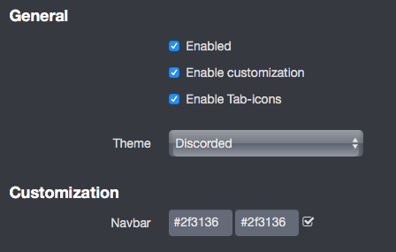
I have lots of these on mine and I love the control it gives me for the interface. I go with the default Discorded theme and then make a few changes from there.
JK, sorry if I was a little "testy" over our last exchange on OctoPrint's forum. Work stress driving me into the ground, what else can I say. Adding a boosted WiFi/BT HAT to the Zero in an attempt to alleviate some of the queue for a single-core would have never worked anyways due to pin conflicts. However, I am now curious and looking into the new BananaPi Zero clone, at least it's a quad-core... but the SW/FW compatibility is probably a disaster.
Themeify is great, btw. Always a good feeling to have even just the "little stuff" like a web interface match perfectly with all your HEDT hardware, workstation furniture, 3D printer, etc. I'm still getting used to all the caveats, sorry if any of these things are painfully obvious that I missed. My question is... (and due to the aforementioned work conditions, I just don't have the time to really dig into this so as to not bother anyone else with this)... but is there a way with Themeify, or any other plugin that exists, where the user can modify more than just primarily CSS content to customize the theme?
For instance: no offense, I'd just rather not have an Emoji up at the title block of my control panel, I'd like to change the actual page title too, and I believe there is a plugin that actually actively refreshes the HTML , etc. according to the current print status, so I'll at least look into that... but still.
And the "cephalopod" motif isn't really a favorite of mine (I know there's a plugin that can also address this to a degree, and there's other HTML tricks/browser add-ons that can solve some of this in an indirect way). Not just being snobbish, but the "green tentacle" favicon for the web browser just isn't easy for me to locate when I have a significant amount of tabs active. Haha that's my personal problem I guess, but I'm just using it as an example for now.
But overall, awesome job, much thanks to the dev for making this plugin.
I honestly don't even remember whatever that must have been about. I self-actualized a long time ago so I don't let too many things get under my skin, to be honest.
Bingo. We've totally thought about that. How cool would it be to just jQuery anything you wanted to in the interface? Granted, you'd probably end up eventually with spaghetti code like the Robo 3D GUI to the point where nobody no longer understands it. But their plugin does just what you're describing. More
Been there, done that. That mod is the line in the post above (search for "#temperature-graph"). Note the tentacle change-out as well.
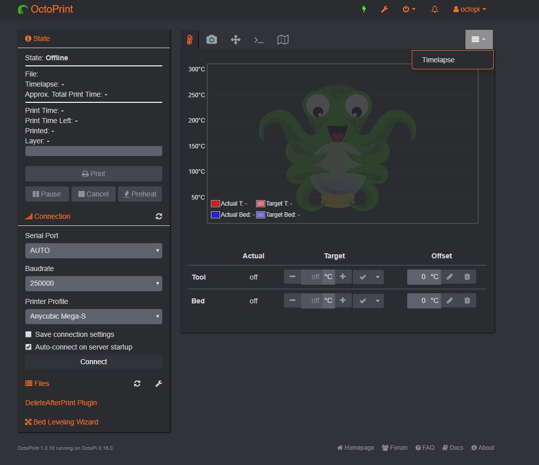
Is the overflow moving items to the dropdown to the right supposed to do like this even when lots of free space? I guess it's counting letters or number of tabs and not knowing about the narrow icons?
Check out the Black Pearl theme that I have on mine. I upgraded the octopus and tentacle. There are times when I run a dedicated webcam server and just drop the output of that behind the temperature graph; that also works out nicely.
So I'll post here my GUI modificacions and improvements. Thanks for all your work.
Selector                   CSS-Rule          Value      Info
.container                 width             100%       Adapt to any screen size
.span8                     width             72%        Approx. to fit the remaining space

*Corrected Dropdown to stay in the nav bar
#navbar_plugin_m33fio      position          inherit
#navbar_plugin_m33fio      height            20px
#navbar_plugin_m33fio      margin-left       30px

*Reduce space below navbar (I dunno if that space is reserved for something)
#navbar                    margin-bottom     0px
pd: One day I'll learn how to do all that fancy tables and formatting.
The Themeify Plugin is absolutely great! And for those of you looking to max out on the functionality, I've come across a sweet way to access all the possible containers to edit.
I use Chrome for all my browsing and it has a nice feature; the console. Press F12 on any page to bring it up and under the Elements tab, you can freely browse all of the elements of the page you're viewing. Hovering over each "<div " highlights the corresponding area on the page so you know exactly which div is for which part of the page. Following down the hierarchy will lead you to the place you want to edit.
For me, I wanted to make the list of "Files" be longer so that I could see more of them at once. For this, I added the following two styles:
Is there any way possible to move the files section under the temp,control.... box? or at least make the files box wider where it is and relocate the State and Connection info.
Hello everyone. I am just getting started with Octoprint, and I was FINALLY able to get my settings just right so that I can make everything take up the full width of the screen on a desktop, and still have it be usable on mobile.
That said, I want to be able to make it be more than just usable, and have it look nice on mobile. However, I think that the CSS trick that I need to be able to use is:
@media only screen and (max-width: 600px) {
 *Add Mobile Specific CSS code here*
}
How do I get that code into OctoPrint? I tried editing the Themify '.less' files but that doesn't appear to do anything.
I'm basically just trying to make it look like the screen squish plugin on mobile(and maybe hide some panels). And have it be wide on desktop.
Any help here would be appreciated.
Thanks. I had already tried that one. I might try it again, but I just didn't like it much.
EDIT: It is better than the regular interface on mobile, but I think the main thing I want is for the webcam stream and the controls to be on the same screen.